CSS

CSS is Awesome.

Topics: tools, development

Author: Maitrik

Articles & Tuts

Tools and playground

Topics

Grid

Flex

.parent-flex-container {
    display: flex;  <-- or inline-flex -->
    flex-direction: row | row-reverse | column | column-reverse;
    flex-wrap: nowrap | wrap | wrap-reverse;
    flex-flow: <‘flex-direction’> || <‘flex-wrap’>;
    justify-content: flex-start | flex-end | center | space-between | space-around;
    align-items: flex-start | flex-end | center | baseline | stretch;
    align-content: flex-start | flex-end | center | space-between | space-around | stretch;
}

.child-flex-item {
    order: <integer>;
  lex-grow: <number>;  <-- default 0 -->
    flex-shrink: <number>;  <-- default 1 -->
    flex-basis: <length> | auto;  <-- default auto -->
    flex: none | [ <'flex-grow'> <'flex-shrink'>? || <'flex-basis'> ]
    align-self: auto | flex-start | flex-end | center | baseline | stretch;
    align-
}

BEM vs ITCSS

  • BEM 101
  • BEM Definitions
  • BEMCSS architecture
  • BEM Problem and how to avoid them
  • BEM vs SMACSS
  • Inverted Triangle CSS - ITCSS
  • Inverted Triangle architecture
    • Settings – used with preprocessors and contain font, colors definitions, etc.
    • Tools – globally used mixins and functions. It’s important not to output any CSS in the first 2 layers.
    • Generic – reset and/or normalize styles, box-sizing definition, etc. This is the first layer which generates actual CSS.
    • Elements – styling for bare HTML elements (like H1, A, etc.). These come with default styling from the browser so we can redefine them here.
    • Objects – class-based selectors which define undecorated design patterns, for example media object known from OOCSS
    • Components – specific UI components. This is where majority of our work takes place and our UI components are often composed of Objects and Components
    • Utilities – utilities and helper classes with ability to override anything which goes before in the triangle, eg. hide helper class

CSS Animation & Transitions

Responsive design

CSS inheritance

  • inherit : Sets the property value applied to a selected element to be the same as that of its parent element.
  • initial : Sets the property value applied to a selected element to be the same as the value set for that element in the browser's default style sheet. If no value is set by the browser's default style sheet and the property is naturally inherited, then the property value is set to inherit instead.
  • unset : Resets the property to its natural value, which means that if the property is naturally inherited it acts like inherit, otherwise it acts like initial.
  • revert :Reverts the property to the value it would have had if the current origin had not applied any styles to it.

SVG/Font-Icons

CSS Clip/Mark

Web-Components

SCSS

//Define Variable

$font-stack: Helvetica, sans-serif;
$primary-color: #333;

// Import CSS file
@import 'reset';

//Mixin

@mixin border-radius($radius) {
    -webkit-border-radius: $radius;
    -moz-border-radius: $radius;
    -ms-border-radius: $radius;
    border-radius: $radius;
}
.box { @include border-radius(10px); }

//Extend / Inheritance

.message {
  border: 1px solid #ccc;
  padding: 10px;
  color: #333;
}
.success {
  @extend .message;
  border-color: green;
}

What is CSS ?

Relational selectors

  • ul li :descendant selector matches nested li
  • ol > li : child selector matches li in ol but not nested ul
  • li.myClass + li : adjacent sibling
  • li.myClass ~ li : general sibling selector matches later siblings, but not nested.

Attribute selectors

  • E[attr] : Element E that has the attribute attr with any value.
  • E[attr="val"] : Element E that has the attribute attr with the exact, case-sensitive if attribute is case sensitive, value val.
  • E[attr|=val] : Element E whose attribute attr has a value val or begins with val- ("val" plus "-").
p[lang|="en"]{ <-- p[lang|="en"]{ <--    <p lang="en-us">  <p lang="en-uk"> --> }
  • E[attr~=val] : Sibling / Element E whose attribute attr has within its value the space-separated full word val.
a[title~=more] { <-- a[title~=more] { <-- <a title="want more info about this?">}
  • E[attr^=val] : Element E whose attribute attr starts with the value val.
a[href^=mailto] {background- a[href^=mailto] {background-image: url(emailicon.gif);}
a[href^=http]:after {content: " (" attr(href) ")";}
  • E[attr$=val] : Element E whose attribute attr ends in val .
a[href$=pdf] {background-image: url(pdficon.gif);}
a[href$=pdf]:after {content: " (PDF)";}
  • E[attr*=val] : Element E whose attribute attr matches val anywhere within the attribute. Similar to E[attr~=val] above, except the val can be part of a word.

  • Note: Multiple attributes work! a[title][href]

@media print{
    abbr[title]:after {
    content: "(" attr(title) ")";
  }
  a[href^=http]:after {
    content: "(" attr(href) ")";
  }
}

Pseudo classes

Basic UI pseudo-classes
  • :enabled
  • :disabled
  • :checked
input[type=checkbox]:checked + label {
  color: red;
}
Form related UI pseudo-classes
  • :valid
  • :invalid
  • :required
  • :optional
  • :in-range
  • :out-of-range
  • :read-only
  • :read-write
  • :default
Structural selectors and Nth Pseudo classes
  • Target elements on the page based on their relationships to other elements in the DOM.

  • Updates dynamically if page updates.

  • Reduced need for extra markup, classes and IDs

    • :nth-child()
    • :nth-last-child()
    • :nth-of-type()
    • :nth-last-of-type()
    • :first-child*
    • :last-child
    • :first-of-type
    • :last-of-type
    • :only-child
    • :only-of-type
    • :root
    • :empty
    • :not(:empty)
tr:first-child,
tr:last-child {
  font-weight: bold;
}
tr:first-of-type,
tr:last-of-type{
  text-decoration:line-through;
}
tr:nth-child(even) {
  background-color: #CCC;
}
tr:nth-child(3) {
  color: #CCC;
}
tr:nth-of-type(odd) {
  background-color: #FFF;
}
tr:nth-of-type(4n) {
  color: #C61800;
}
tr:nth-of-type(3n-1) {
  font-style: italic;
}
Other Pseudo Classes
  • :lang
  • :target
  • :link
  • :visited
  • :hover
  • :active
  • :focus
  • Tab Nav without JS
section:not(:target) > a {
  border-bottom: 0;
  background-color: #eee;
}
section:target > a {
  background-color: white;
}
section:not(:target) > div { z-index: -2; }
section:target > div { z-index: -1; }
Psuedo Element
  • Pseudo-classes select elements that already exist.

  • Pseudo-elements create "faux" elements you can style.

  • ::first-line

  • ::first-letter

  • ::selection (not in specification)

  • ::before

  • ::after

How to use selector in JS
  • jQuery $(selector) == document.querySelectorAll(selector)

Specificity / Speci-FISH-ity

  • Best Doc for specificity

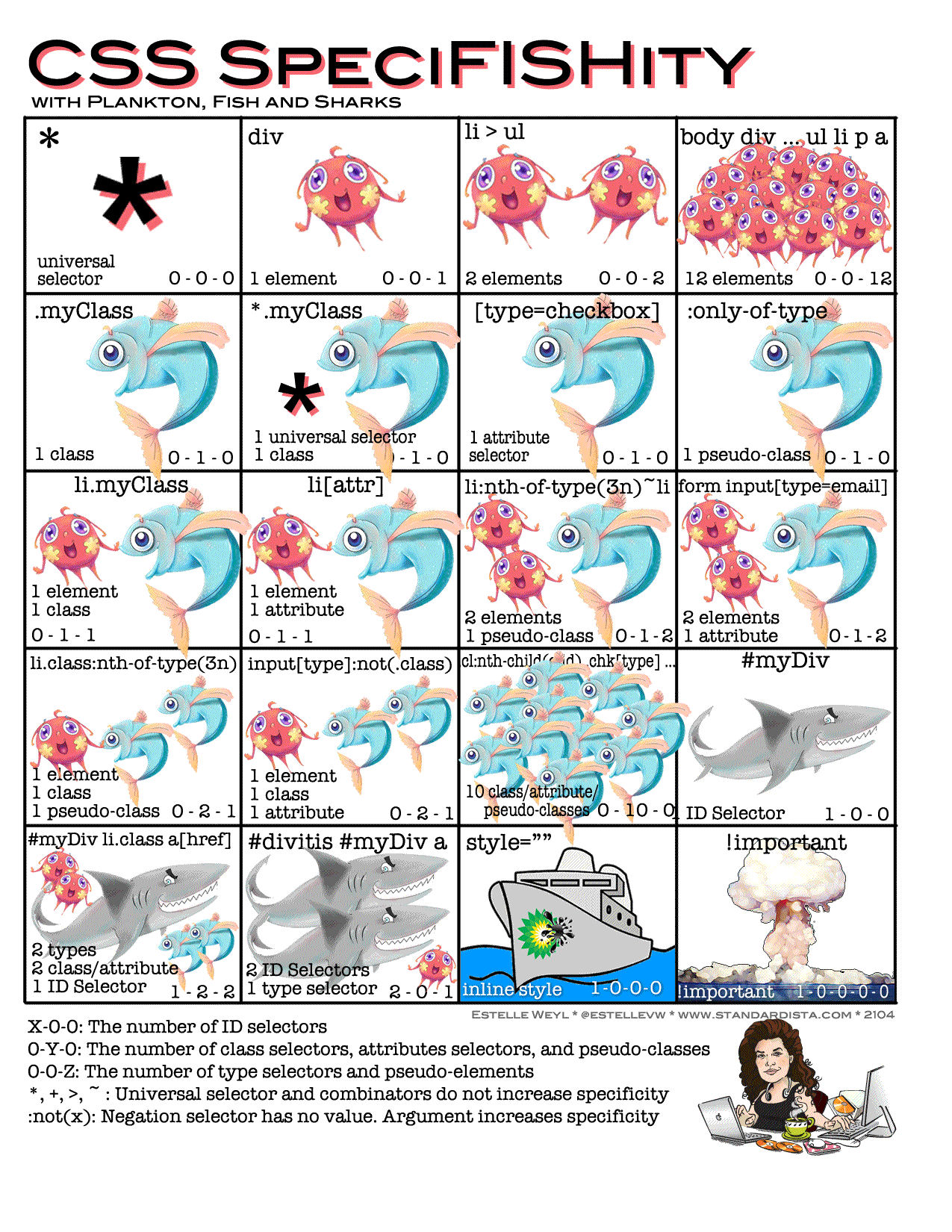
  • Specificity is not inheritance

  • Priority : 0001 = 1 < 0101 = 101 < 1000

  • Important : 1-0-0-0-0

  • Inline Style : 1-0-0-0

  • ID : 1-0-0

  • Class : 0-1-0

  • Element : 0-0-1

  • Global Selector : 0-0-0

ul > li { color : red } // 0-0-2
ul li { color : blue } // 0-0-2 : will apply due to order
  • Example

    • { } ----- 0
    • li { } ----- 1 (one element)
    • li:first-line { } ----- 2 (one element, one pseudo-element)
    • ul li { } ----- 2 (two elements)
    • ul ol+li { } ----- 3 (three elements)
    • h1 + universal[rel=up] { } ----- 11 (one attribute, one element)
    • ul ol li.red { } ----- 13 (one class, three elements)
    • li.red.level { } ----- 21 (two classes, one element)
    • style=”” ----- 1000 (one inline styling)
    • p { } ----- 1 (one HTML selector)
    • div p { } ----- 2 (two HTML selectors)
    • .sith ------ 10 (one class selector)
    • div p.sith { } ----- 12 (two HTML selectors and a class selector)
    • sith ------ 100 (one id selector)
    • body #darkside .sith p { } ----- 112 (HTML selector, id selector, class selector, HTML selector; 1+100+10+1)

Generated Content

:before and :after
  • before and after must need the 'content"
<p>
    <before>before content - </before>
        the content
    <after> - after content</after>
</p>

Media Query

  • @media screen & @media print

  • In link

<link rel='stylesheet' media='screen and (min-width: 320px) and (max-width: 480px)' href='css/smartphone.css' />
  • In CSS
@media screen and (max-width: 480px){
  a {
  transition: background-color 200ms linear 50ms;
  }
}
  • Media Query Options

    • (min/max)-width: viewport width
    • (min/max)-height: viewport height
    • (min/max)-device-width: screen width
    • (min/max)-device-height: screen height
    • orientation: portrait(h>w) | landscape(w>h)
    • (min/max)-aspect-ratio: width/height
    • (min/max)-device-aspect-ratio: device-width/height
  • Media Query Syntax/Punctuation/Tidbits

media="only print and (color)"
media="only screen and (orientation: portrait)"
media="not screen and (color)"
media="print, screen and (min-width: 480px)"
@media screen and (-webkit-min-device-pixel-ratio: 2) {
 .iphone4 { <-- high DPI -->}
}
@screen and (transform-3d) {
  .transforms {}
}

Viewport

  • The viewport varies with the device, and will be smaller on a mobile phone than on a computer screen.
  • Before tablets and mobile phones, web pages were designed only for computer screens, and it was common for web pages to have a static design and a fixed size.
<meta name="viewport" content="width=device-width, initial-scale=1, maximum-scale=1"/>

Font Face

  • How to add font files
@font-face {
  font-family: 'blah';
  src: url('blah.eot');
  src: url('blah.eot?#iefix')
         format('embedded-opentype'),
     url('blah.woff') format('woff'),
     url('blah.ttf') format('truetype'),
     url('blah.svg#blahRegular') format('svg');
  font-weight: normal;
  font-style: normal;
}
  • How to add/apply in CSS selectors
body {
  font-family: 'blah', arial, san-serif;
}
  • Text Shadows
text-shadow: left top blur color;
.trans { text-shadow: 0 5px 1px rgba(0,0,0,0.2);}
  • box-shadow: inset? [horiz][vert] [blur][spread] [color];
.rainbow {
  box-shadow: 0 0 0 10px red,
              0 0 0 20px orange,
              0 0 0 30px yellow,
              0 0 0 40px green,
              0 0 0 50px blue,
              0 0 0 60px purple;
}

Background Image

  • background properties

    • background-color
    • background-image : none | url | image-list | element-reference | gradient;
    • background-repeat : repeat | repeat-x | repeat-y | no-repeat | space | round;
    • background-attachment : fixed | local | scroll;
    • background-position : top left bottom right;
    • background-clip: border-box | padding-box | content-box;
    • background-origin: border-box | padding-box | content-box;
    • background-size: auto | contain | cover | length;
  • multiple background-image

background-image: url(brown.gif), url(blue.gif);
  • Background shorthand
background: img position / size repeat attachment origin clip,
background: img position / size repeat attachment box{1,2} bgcolor;
background: url(topImg.jpg) 0 0 / 30px 30px repeat scroll border-box content-box,
background: url(botImg.jpg) 15px 15px / 30px 30px fixed border-box #609;

Border

  • border-width: (length) | thin | medium | thick | inherit {1,4};
  • border-radius: top right bottom left;
  • border-color: top right bottom left;
  • Border shorthand
border: width style color;
border-left: width style color;
  • border-image: source || slice / width / outset || repeat;

CSS Gradient

Transforms

  • trasform:
    • translate(length[, length])
    • translateX(length)
    • translateY(length)
    • scale(number[, number])
    • scaleX(number)
    • scaleY(number)
    • rotate(angle)
    • skewX(angle)
    • skewY(angle)
    • matrix(num, num, num, num, num, num)

Transitions

  • Enables the transition of properties from one state to the next over a defined length of time
  • transition-property: properties (or 'all') that transition
  • transition-duration: s or ms it takes to transition
  • transition-timing-function: bezier curve of transition
  • transition-delay: s or ms before transition starts
  • transition: shorthand for 4 transition properties
@keyframes tutsFade {
  0% {
    opacity: 1;
  }
  100% {
    opacity: 0;
  }
}

.element {
  animation-name: tutsFade;
  animation-duration: 4s;
  animation-delay: 1s;
  animation-iteration-count: infinite;
  animation-timing-function: linear;
  animation-direction: alternate;
}

/* Short version */
.element {
  animation: tutsFade 4s 1s infinite linear alternate;
}